UX Case Study

Voxmoon is a language learning app aimed at helping individuals 18 and older, specifically university/college students learn language terms in a fun, easy way that works with their busy schedule. This is especially relevant for students studying abroad.
Before touching anything related to design, I wanted to understand my users’ needs and pain points better to start building my problem statement aligned with a targeted user centered product, so I conducted a competitive analysis of current vocab learning apps on the market and conducted preliminary user interviews.
Competitive Analysis
This stage in the process allowed me to examine both the negative and positive feature aspects of other apps in the market. My findings provided me insight into possible target audiences, user goals and pain points, informing me of what the problem is, as well as what has been attempted to solve it.

Anki
Positive Unique UX Features
The ability to customize your terms cards within the app including adding images or audio clips
The ability to export cards for offline use
Quizlet
Positive Unique UX Features
The ability to find user card sets aligned with your college/university and specific classes
The ability to set term language
Brainscape
Positive Unique UX Features
The ability to download decks from a class of interest
The ability to use professional class decks and not only user decks
Clear non-abrasive advice for how to use each function
Positive feature aspects all apps shared were kept in mind including:
ability to sync information across all apps
multiple options to review or study terms
ability to see number of terms you’ve studied
ability to access shared decks
ability to create your own cards, folders or decks
In some apps these features were absent or lacking:
Ability to see your specific progress when studying
Ability to see a timer to accurately measure how long it takes to answer
Ability to set goals
Ability to create study plans
Ability to set reminders
More ways to customize your cards or learning options
Examining positive features gave me an ideas of what successful feature aspects I could adapt in my own app. Examining competitor weak points gave me an idea of what other study apps lack and what could be added to my app to better meet user needs.
User Interviews
In order to come up with solutions / features that will be helpful for users, I conducted 5 interviews with users who had experience, especially current experience in studying new vocab in-person and over Zoom. I looked at the purpose of their studying, their habits, study methods, their feelings and difficulties in learning new words.
After gathering insights from interviews, I identified common actions, thoughts and feelings, users had which indicated their needs and pain points.
DOING
Studying a new language through an app (Duolingo), flashcard app or through online resources (books, forums, blogs, ebooks)
Studying occurred in the morning, evening or in between chores and tasks during the day
Frequency occurred at least multiple times a week, once to a few times a day, mostly for 5-15 minutes at a time
THINKING
Difficulty learning on your own
Wishing for more speaking opportunities
Difficulty to retain learned words in conversation
Would like authentic materials
FEELING
Enjoy being able to use learnings in real life (meetings, conversations, etc.)
Enjoy when it doesn't feel like studying
Enjoy when it's authentic materials
Like apps that have colour, game function and show stats
User personas were created from the information gathered in user interviews and competitive analysis. They were used to encourage a user centered approach by describing our target users and figuring out what exactly they need from the product to be designed.
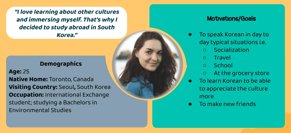
User Problems
“I want to study in a short time frame, so that I can study after I’m finished school work or before I start my classes in the morning and be able to go to bed and get to my classes on time.”
“I want to be able to study terms again and again at different time gaps, so that I can better remember words . “
“I want to be able to be aware of terms I have difficulty with and practice those terms more, so that I can improve.
“ I want to use authentic materials and learn terms in context, so that I can apply what I learn in real life.”
“I want to learn correct pronunciation and practice speaking , so that I am comfortable doing so in real life with accuracy. “
“I want to study in a fun way, so that I’m more motivated to study and it doesn’t feel like more work.”
Problem Statement
Users 18 and older needs a way to study terms in a fun easy way because they're busy with school work most of the day and don’t want to be bored. We will know this to be true when we see that users are spending more time studying and maintaining their studying habits due to increased motivation.
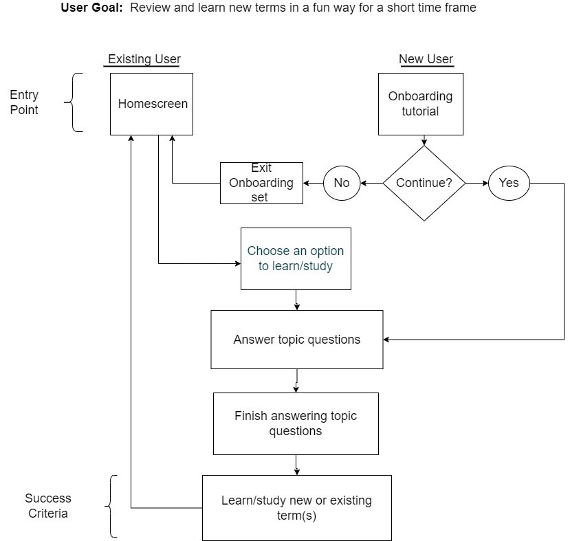
User research findings were used to generate pivotal user tasks for the app based on user problems and needs. User flows were used to plan out intuitive user task flows and navigation.
Wireframes
User flows were translated into initial paper wireframes.
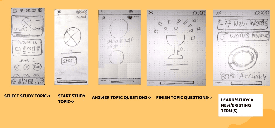
Task 1: Review and learn new terms in a fun way for a short time frame
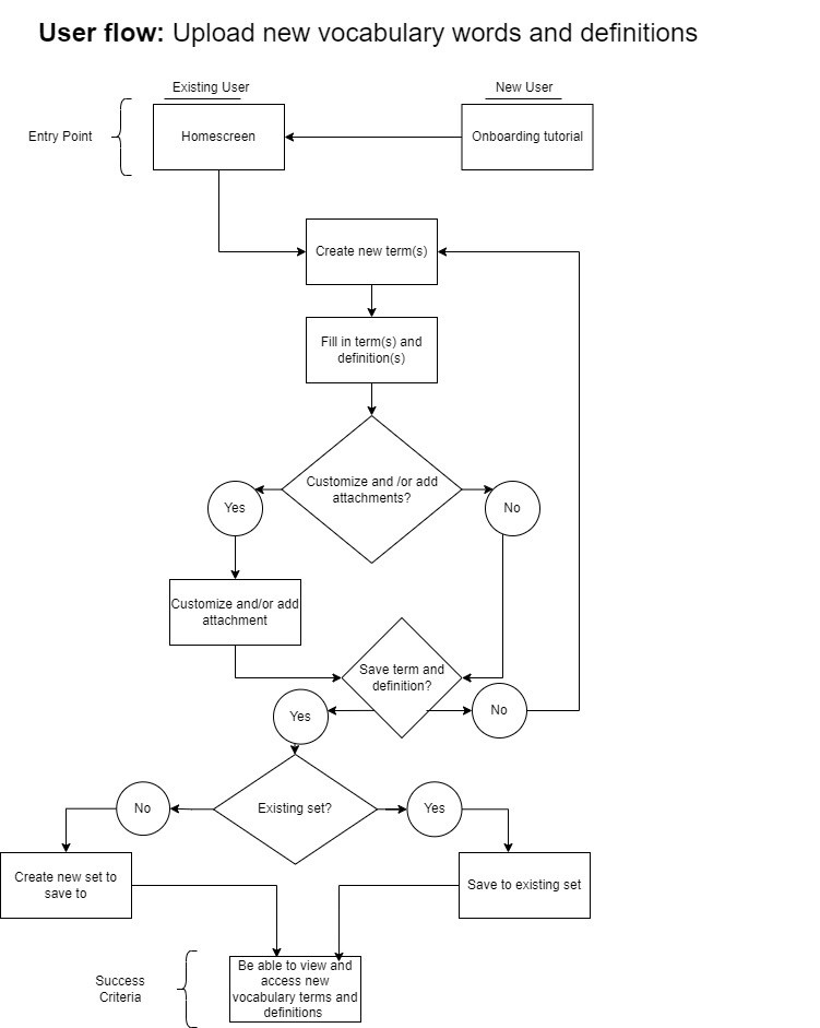
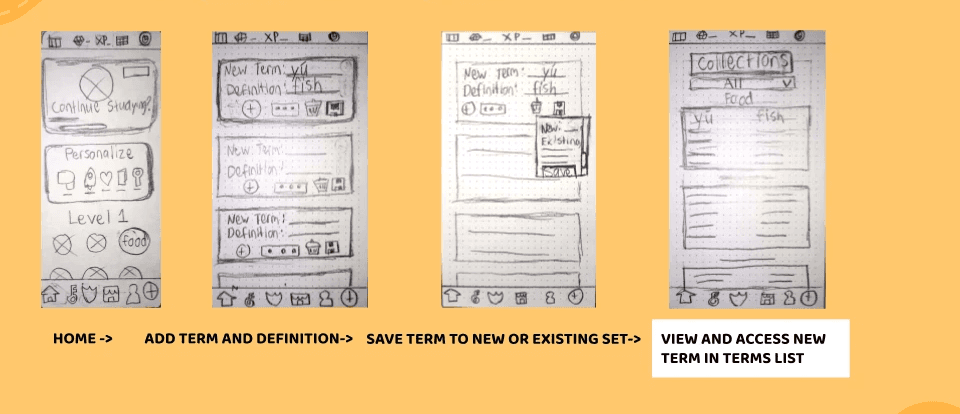
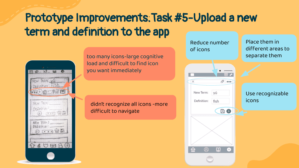
Task #2: Upload new vocabulary words and definitions
Testing
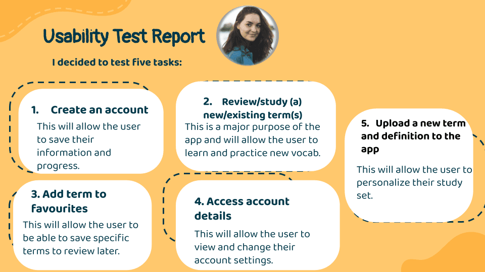
To further iterate on the designs and make improvements, usability testing was conducted over Zoom and in-person for 6 individuals.
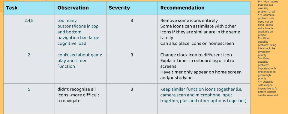
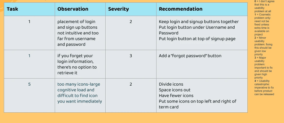
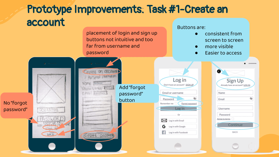
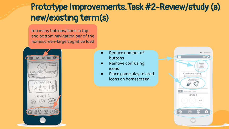
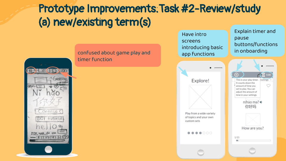
Improvements
Marvel Prototype
Next Steps
Summary: needed more explanation for app concept and less icons with more intuitive meanings
How can we improve?
Card sort
More usability testing with added complexity
Develop user flows for additional tasks
Create a task for usability testing for onboarding
Reduce any more clutter and stagger or remove any unnecessary pop ups or notifications (too many intro screens?)
Create more tasks to check usability of specific icons for functions such as adding a picture to a term card when uploading a term
Learnings
Bianca Serkhanian
UX /UI Designer
Lets connect!
You can message me or
email me at bserkhanian.design@gmail(dot)com


@2023 Bianca Serkhanian