UI/UX Case Study
Overview
The project given by my company was to develop a student centered app that would aid students in studying as it can be difficult to get the support, help and encouragement they need, especially when working online.
There has been an increase in students pursuing studies online due to cost effectiveness and flexibility. Another reason was due to COVID when it was near impossible for students to meet in-person.
To fulfill the requirements of the app, I was provided a project brief which included some details about my user persona, context and required features.
Project Aims
The Coursemate app aims to connect students online to facilitate peer-to-peer learning, support, feedback, and motivation.
My Role
Design Thinking
I attempted to solve the problem by going through the stages of the design thinking process which would help me to:
Have a better understanding of the problem and come up with possible solutions
Understand our users and their needs
Come up with initial foundational designs which would turn into more complex interactive designs
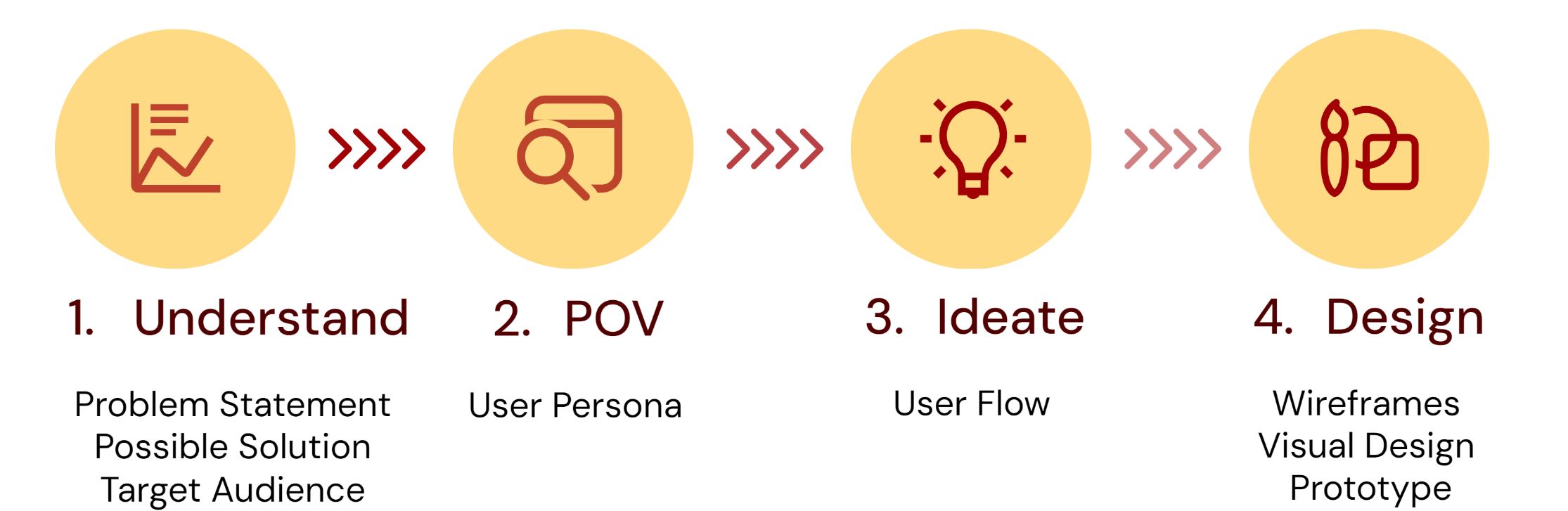
Understand
Problem Statement
Students at university and college level 18 years and older struggle to stayed motivated and engaged with their school subjects and get the help they need, especially when juggling their studies with other life matters such as a job, family illness, etc.
Possible Solution
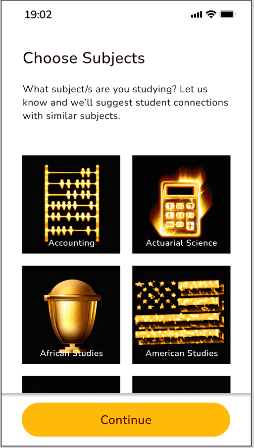
Coursemate, a web responsive app will allow students to:
get inspired
engage with a like-minded student community
when and where they want on any device
connect with other students in their field to:
discuss topics
share insights and support
receive peer feedback on assignments
find others willing to collaborate on projects
study in a fun, interactive way
Target Audience
college and university students 18 years and older working on a degree or diploma
Key Insight Derived
Understanding the problem is a good springboard to think of possible solutions which will lead to the foundational design of pivotal functions for your app
Understanding my target audience will give me information on how, when and where my users will interact with my app and therefore, will inform my design
POV
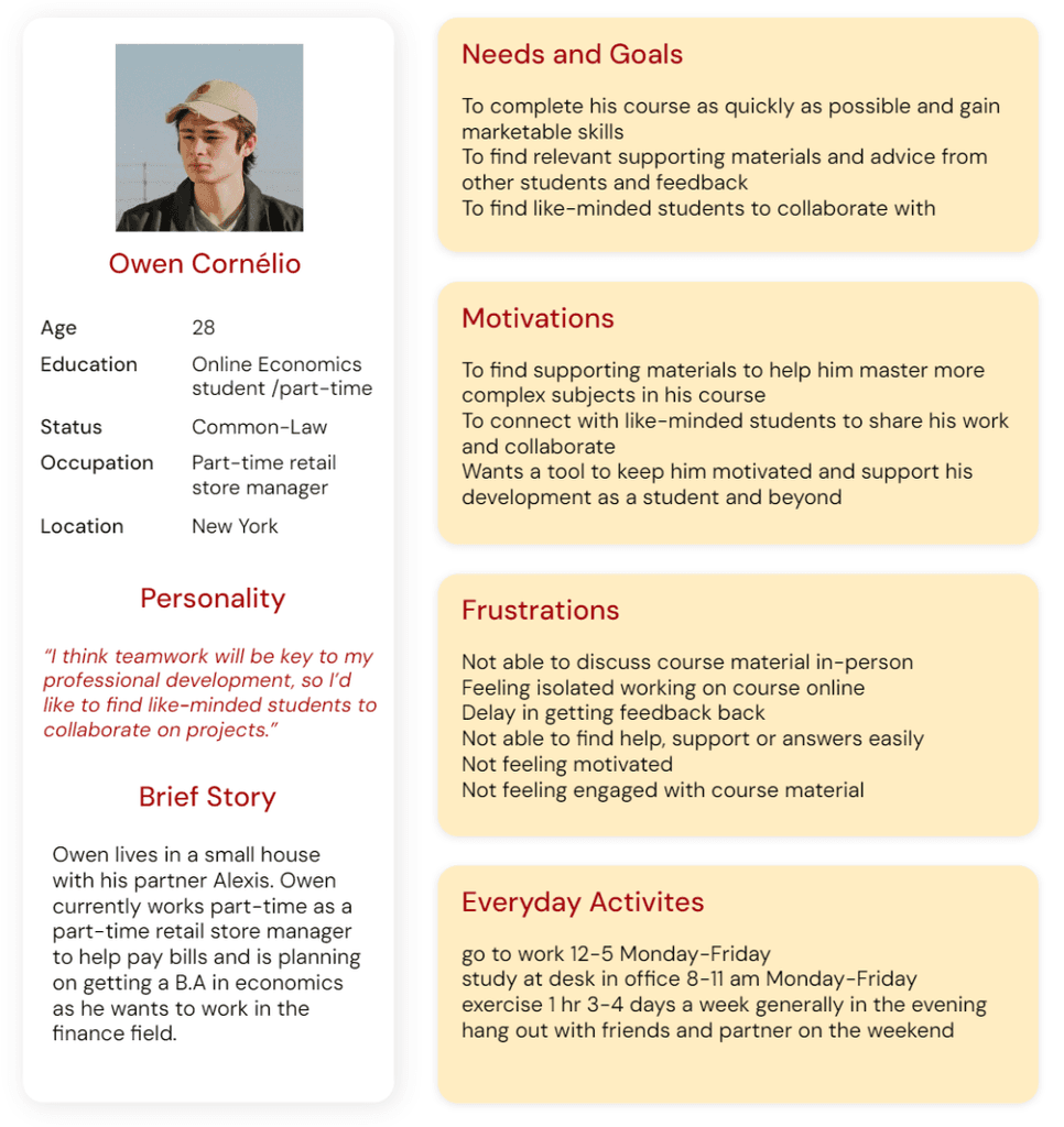
User Persona
To better understand my user, I created a proto-persona using information from the received project brief.
Key Insight Derived
Having a user persona in mind while designing will keep your designs user-centered → user-centered designs increase customer satisfaction, reduce cost and risk and increase productivity of the design team
A user persona is a great summary of your key target audience’s needs and goals and what they would want in an app
a user persona will direct the design elements you create as well as the features you choose to implement
Ideate
User Flows
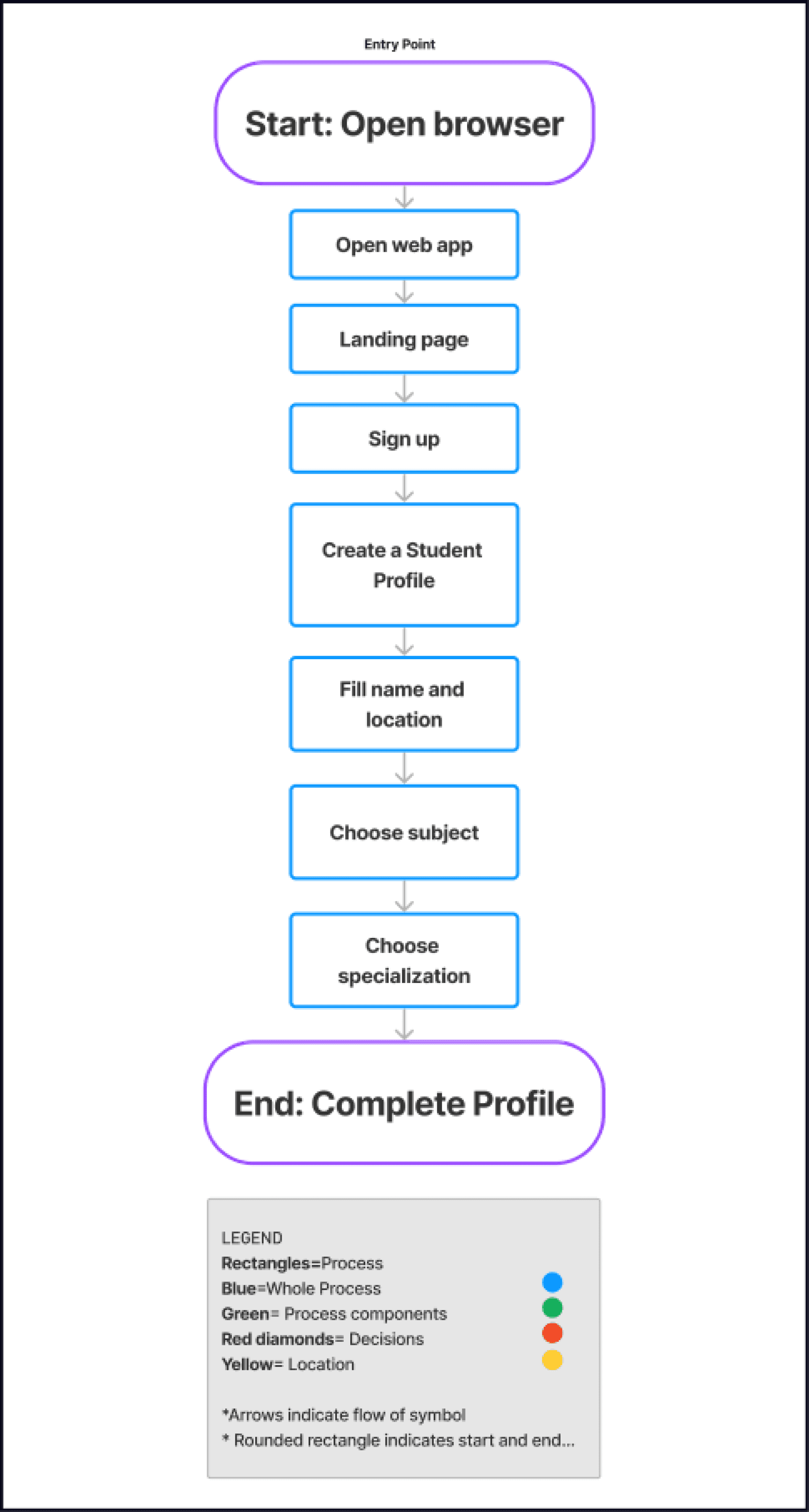
To better understand how our user would interact with our app and to help us visualize what paths our users would take, I created user flows.
User Flow #1- Create a Student Profile
User Flow #2- Search for Students
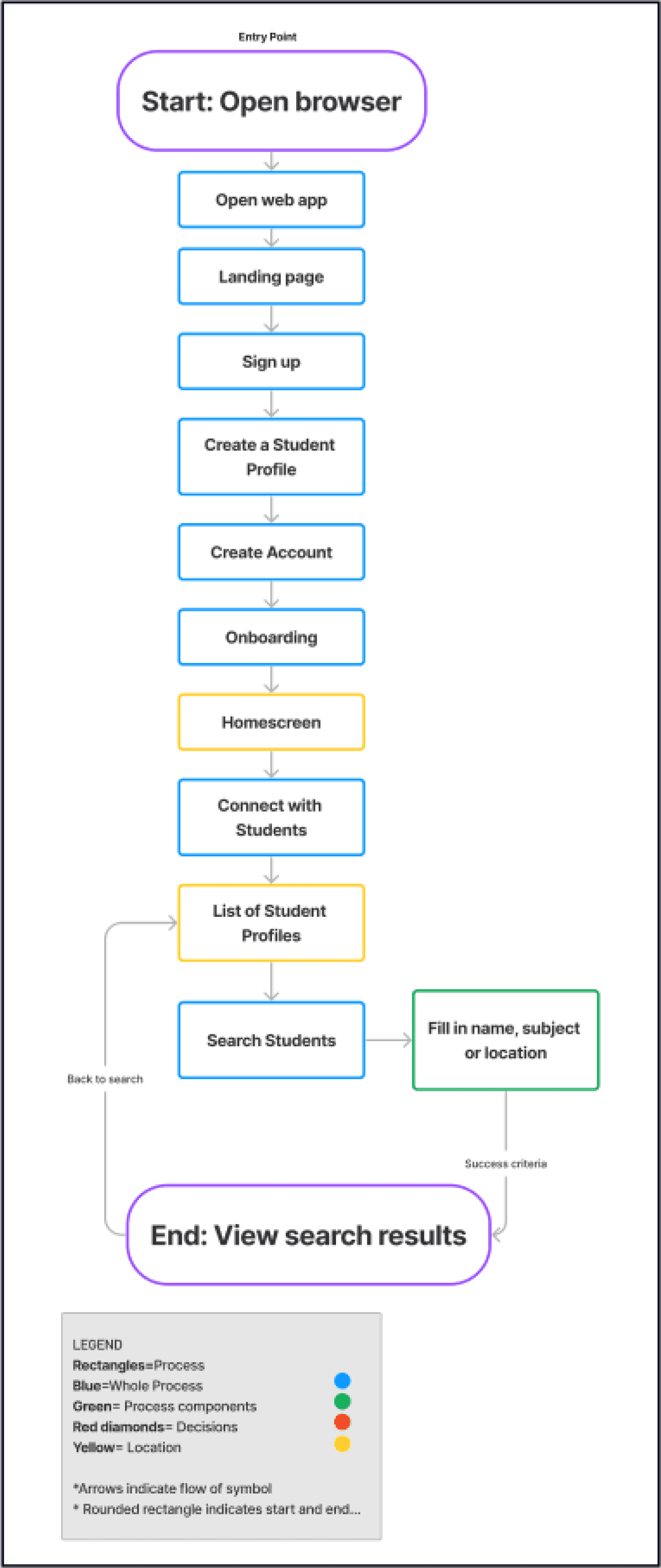
Key Insight Derived
Great way to create an intuitive interface by making features accessible and easy to navigate
Easy to see what areas you need to review and improve if screen patterns don’t make sense or if one screen is not flowing into the next
Great way to communicate the flow of an app to stakeholders
Design
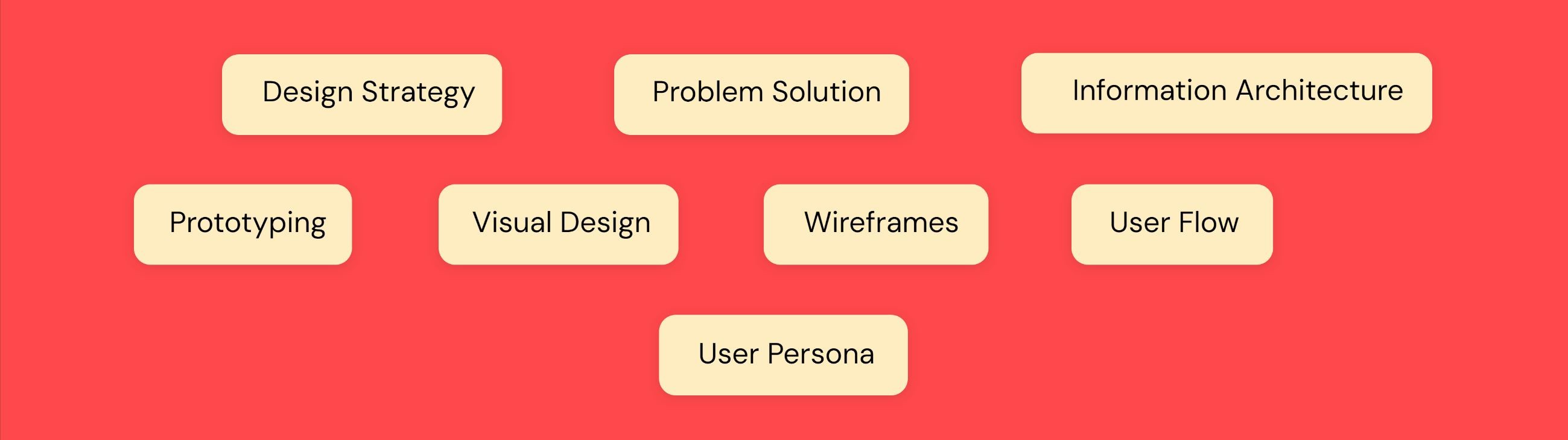
Low and Mid-fidelity Wireframes
Developing wireframes helped me conceptualize page structure, layout, information architecture, user flow, functionality, and intended behaviors.
Low-Fidelity Mobile Wireframes
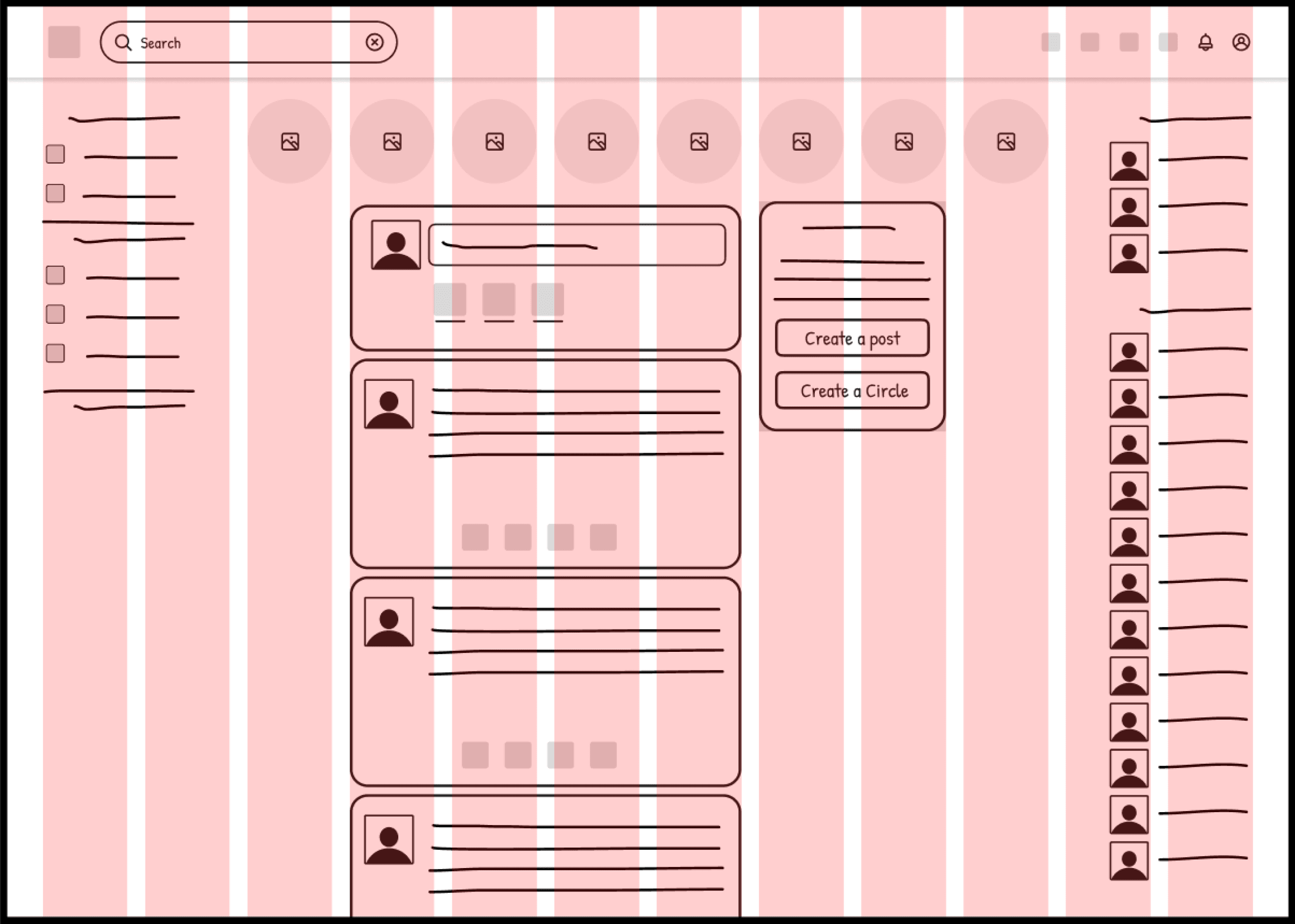
We used a mobile-first approach to map out our user flows and decide on the navigation layout using a low-fidelity wireframing kit on Figma to block out shapes and text.
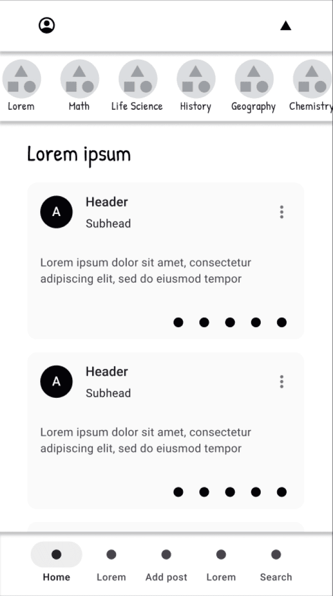
Low-Fidelity Responsive Design for Home screen
We then developed low-fidelity tablet and desktop breakpoints as well to ensure our design would stay consistent and maintain it’s usability between different devices for a responsive design. We used layout grids to precisely layout breakpoints, content, visual hierarchy and spacing.
414 px x 736 px
Columns: 4
Rows: 100
Margin width: 35 px
Gutter width: 20 px
834 px x 1194 px
Columns: 8
Margin width: 35 px
Gutter width: 20 px
1440 px x 1044 px
Columns: 12
Margin width: 40 px
Gutter width: 20 px
Mid-Fidelity Wireframes
We then created mid-fidelity wireframes by implementing common UI patterns and detailed components to aid users in completing tasks from the user flows and more realistically represent what users would interact with.
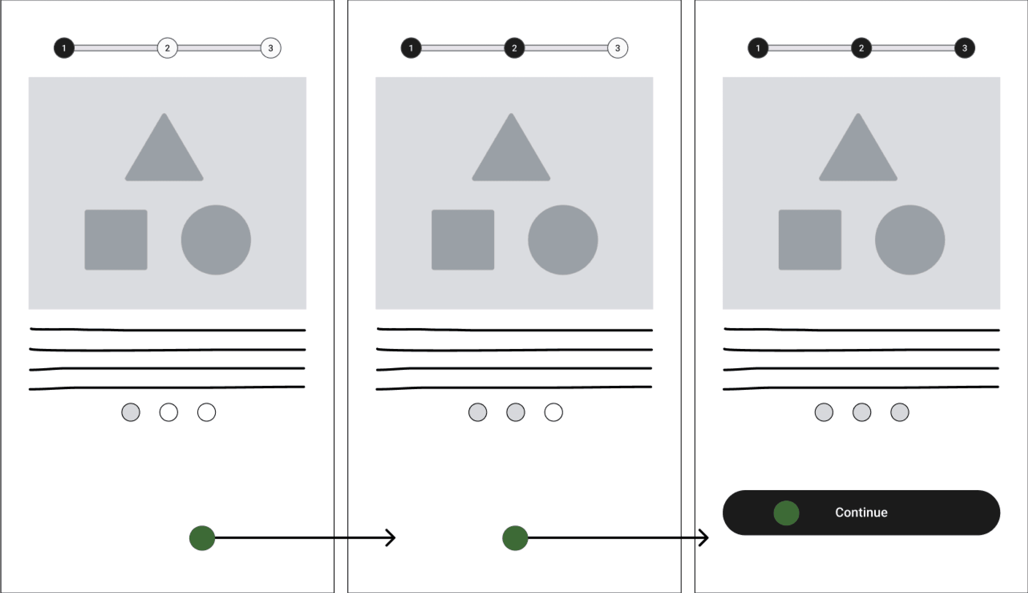
Onboarding- Steps Left pattern implemented for onboarding.
Create Student Profile- No additions made, so no example available
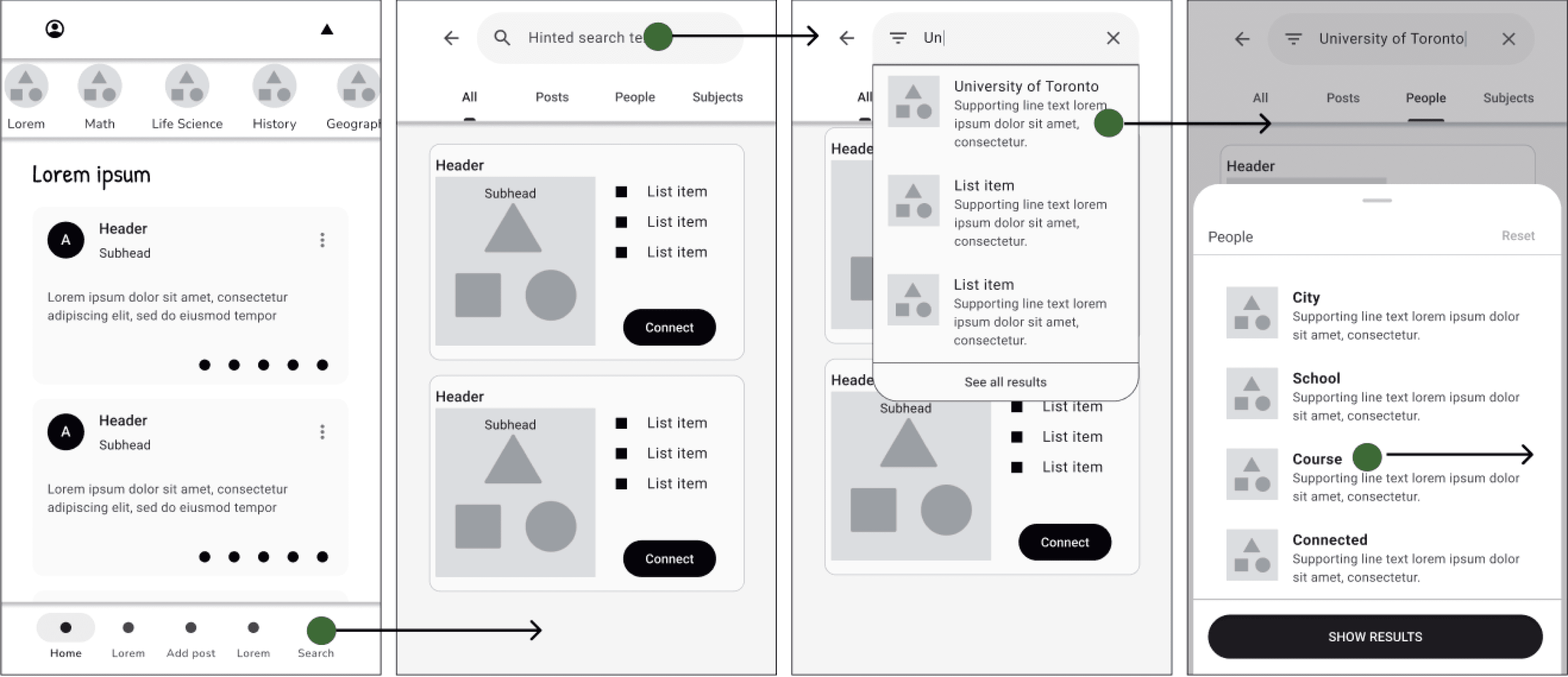
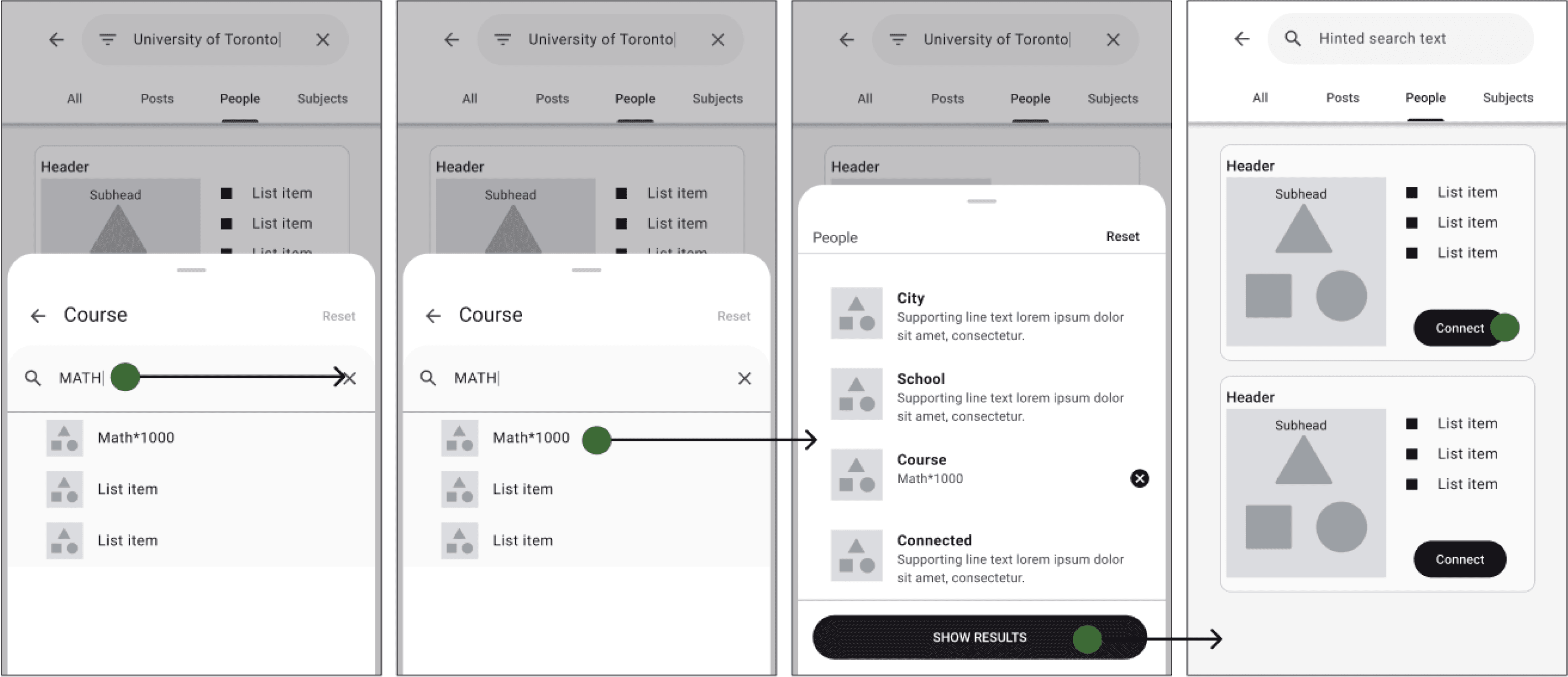
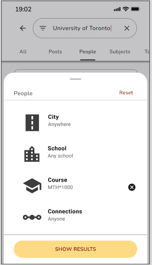
Search students- Search filters and search autocomplete added so users can find classmates more easily. Reset and back arrow allow users to make changes.
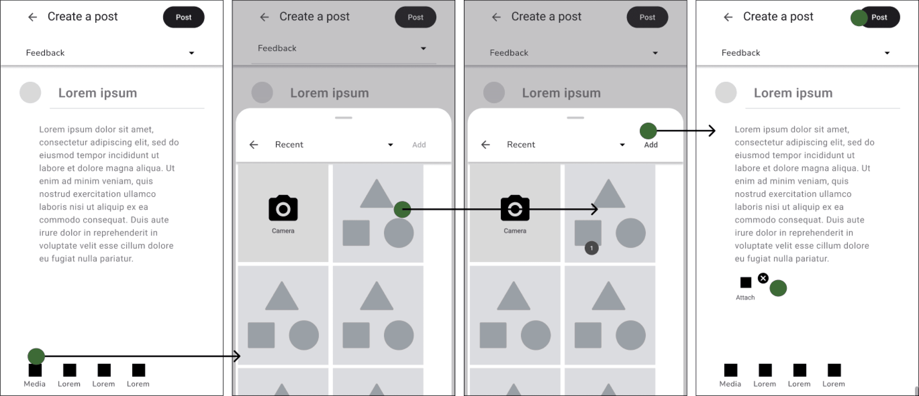
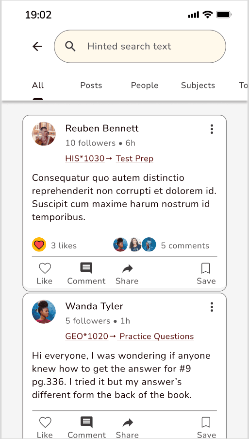
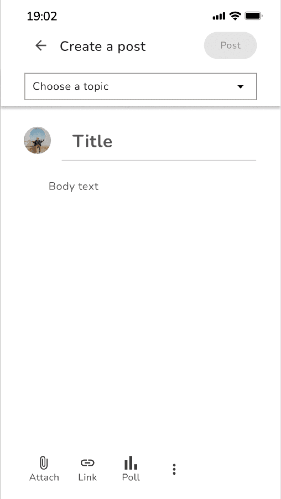
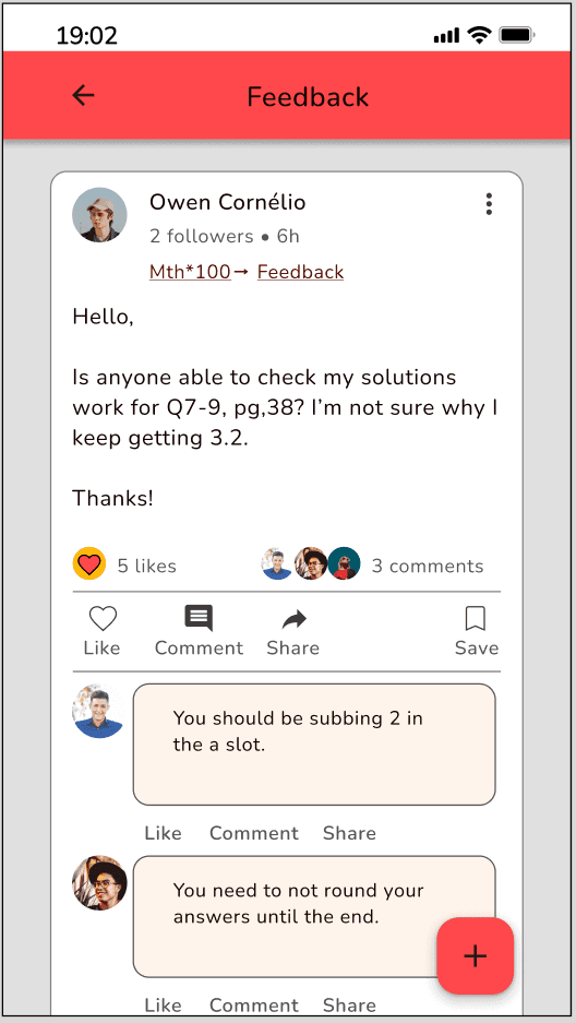
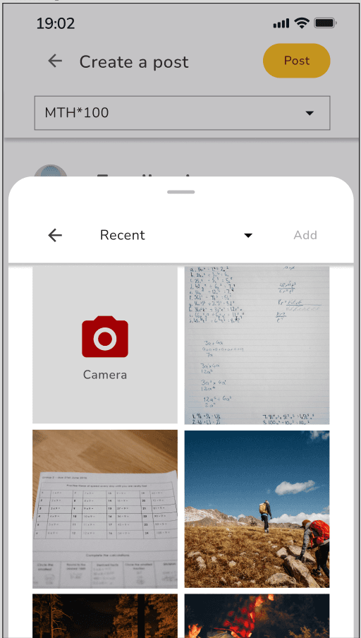
Get feedback- Post template was modified to be more recognizable, accessible and visually appealing to users. Uploading a file was also updated to be more recognizable, simple, accessible and visually appealing. When file added, number added shows and “add” button becomes enabled. File icon also appears on post with x to delete, if user wants to add different file.
Next, we developed mid-fidelity wireframes at different breakpoints.
Visual Design
Afterwards, we focused on establishing a brand identity and a visually appealing design that was both useful and something that users wanted to engage with. We implemented colours, imagery, typography, shapes and icons and continued to follow visual design principles and trends.
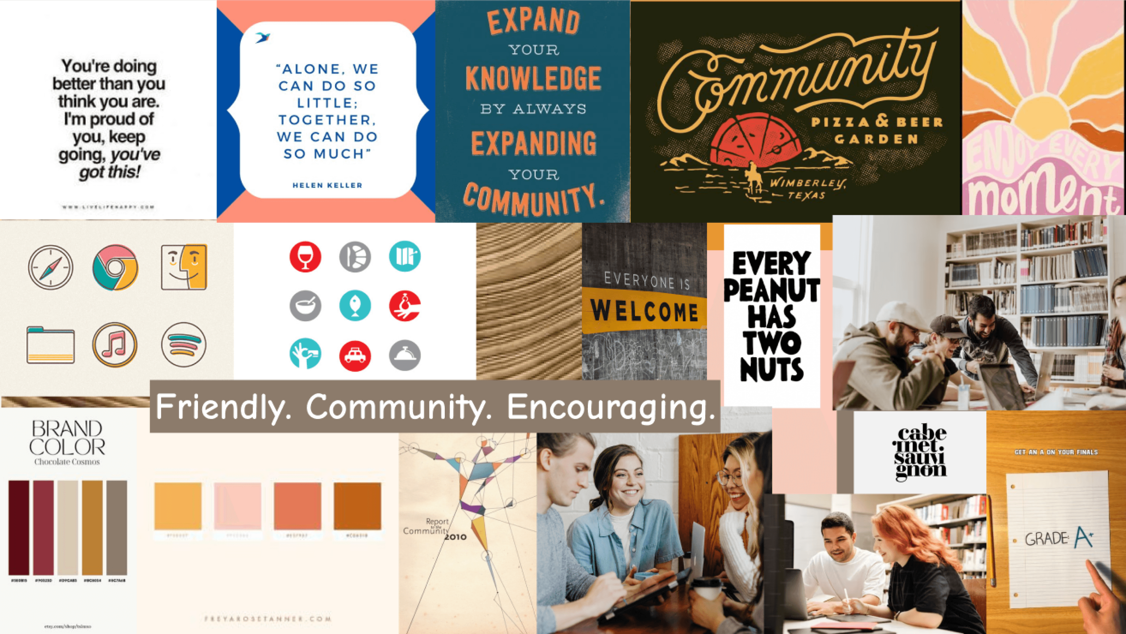
Mood board
We started by creating a mood board which helped lead our visual direction and helped us tell our story. The imagery, colours, quotes and typography we chose was inspired by the words: Friendly, Community and Encouraging. Check it out below:
Style Guide
This led to the development of a style guide which would help us maintain our brand identity. Check out a sample below:
Primary Colours:
#FFFFFF
rgb(255,255,255)
#E0E0E0
rgb(224,224,224)
#FFB909
rgb(255,185,9)
#FE484B
rgb(254,72,75)
Secondary Colours:
#FFF9EB
rgb(255,249,235)
#FF8109
rgb(255,129,9)
#A20104
rgb(162,1,4)
#06939A
#89F5FB
rgb(06939A), (137,245,251)
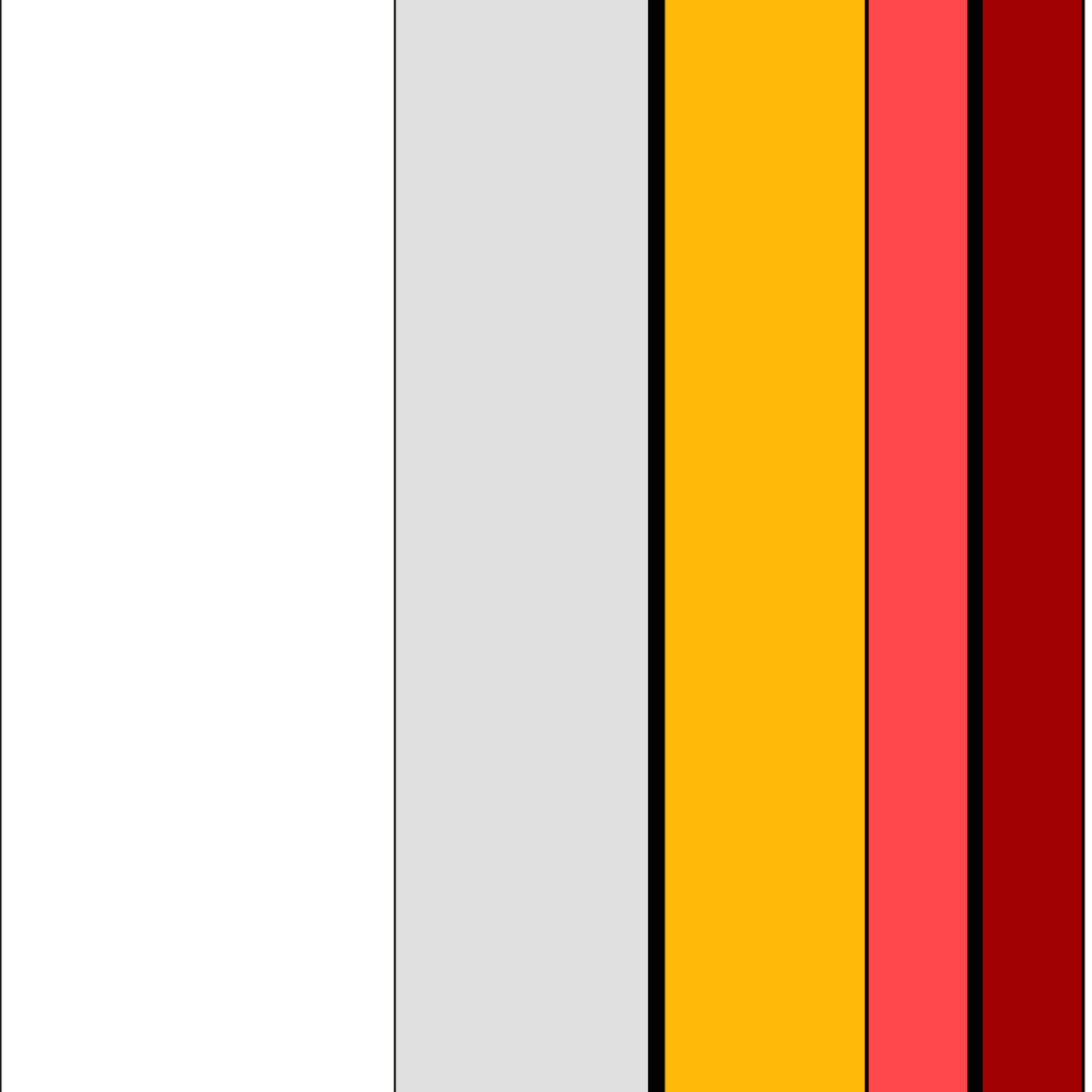
Approximate 60:30:10 Colour Composition
Typography
Heading 4, Bold, 26 px
Heading 5, Medium, 20 px
Heading 6, Medium, 18 px
Body Text 1- Regular, 18 px
Body Text 2 - Regular, 16 px
Body Text 3 - Medium, 14 px
App logo sizes
24
24x24
40x40
60x60
104x104
Icongraphy
UI Elements
Top Nav bar-Includes profile icon, search icon and notification icon Furthest icons align with start of margin 35 px horizontal padding .
Home
News
Post
People
Message
Bottom Nav bar-Includes home icon, news icon, create post icon, people icon and direct messaging icon. 38 px horizontal padding.
Name
# followers • #h
Subject→ Topic
Consequatur quo autem distinctio reprehenderit non corrupti et dolorem id. Suscipit cum maxime harum nostrum id temporibus.
# likes
# comments
Like
Comment
Share
Save
Post with likes and comments- Includes post, reply notification and replies
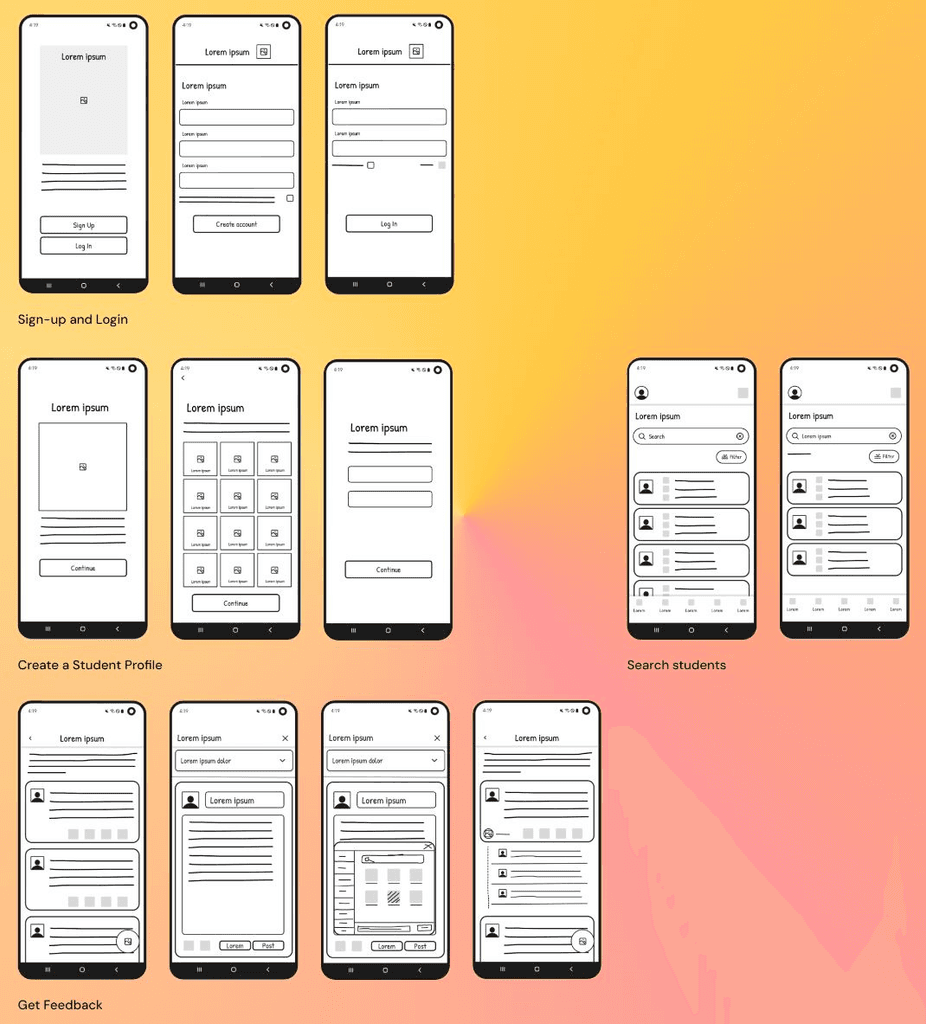
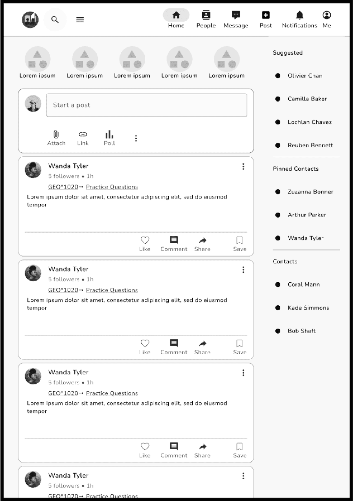
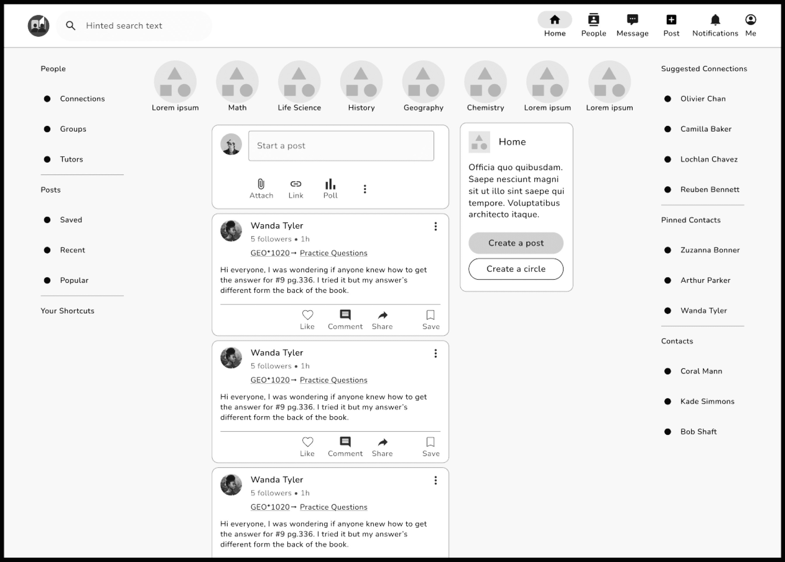
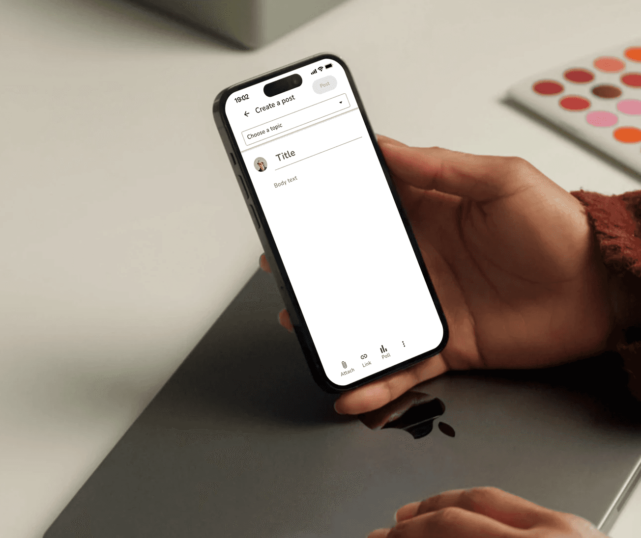
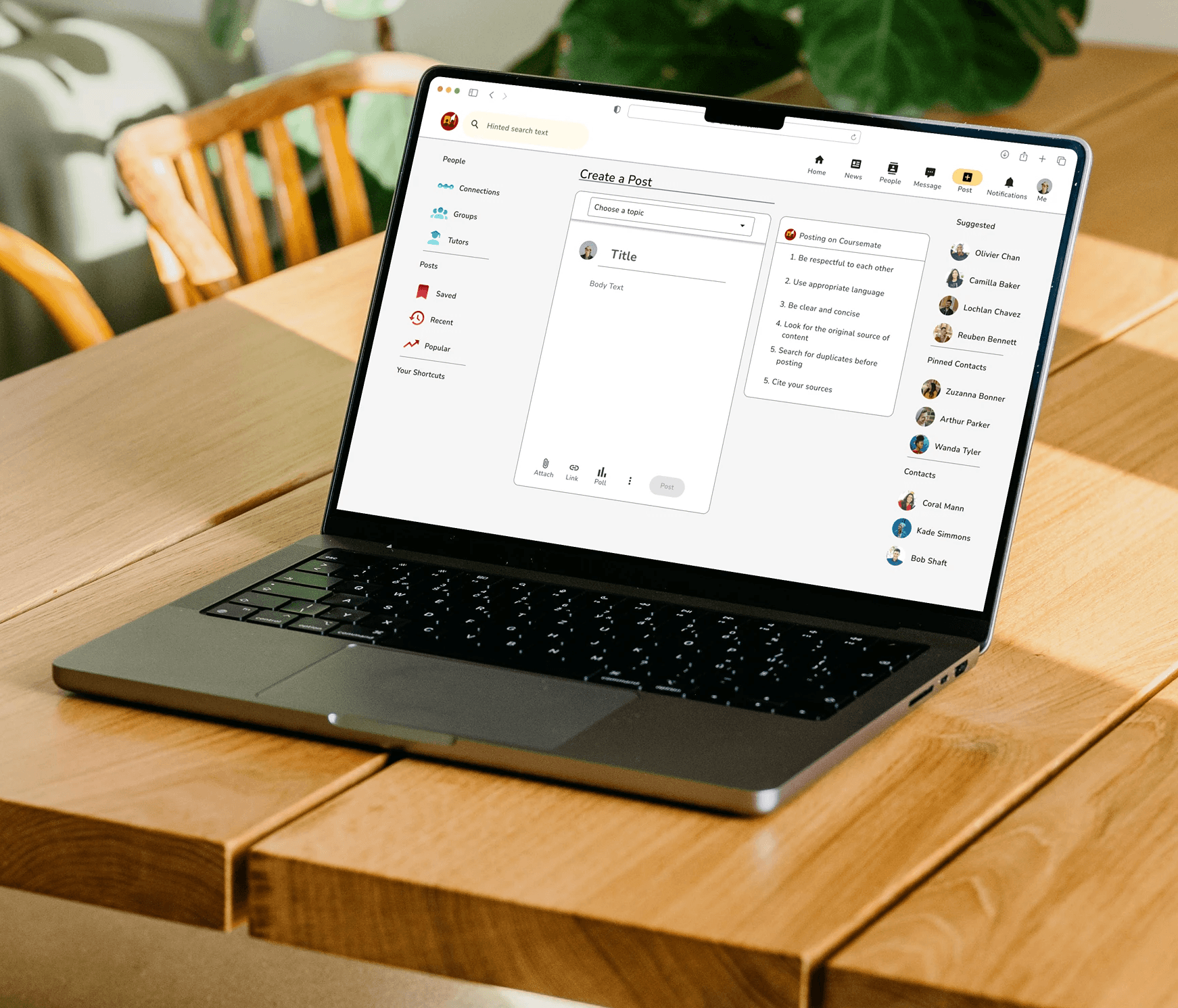
Final Mockup
Afterwards, we focused on establishing a brand identity and a visually appealing design that was both useful and something that users wanted to engage with. We implemented colours, imagery, typography, shapes and icons and continued to follow visual design principles and trends.
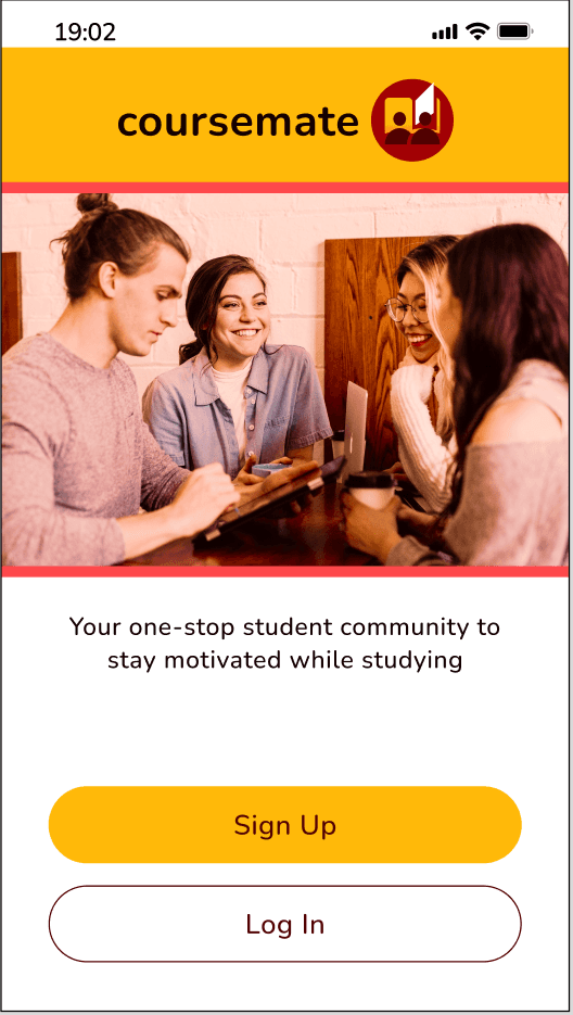

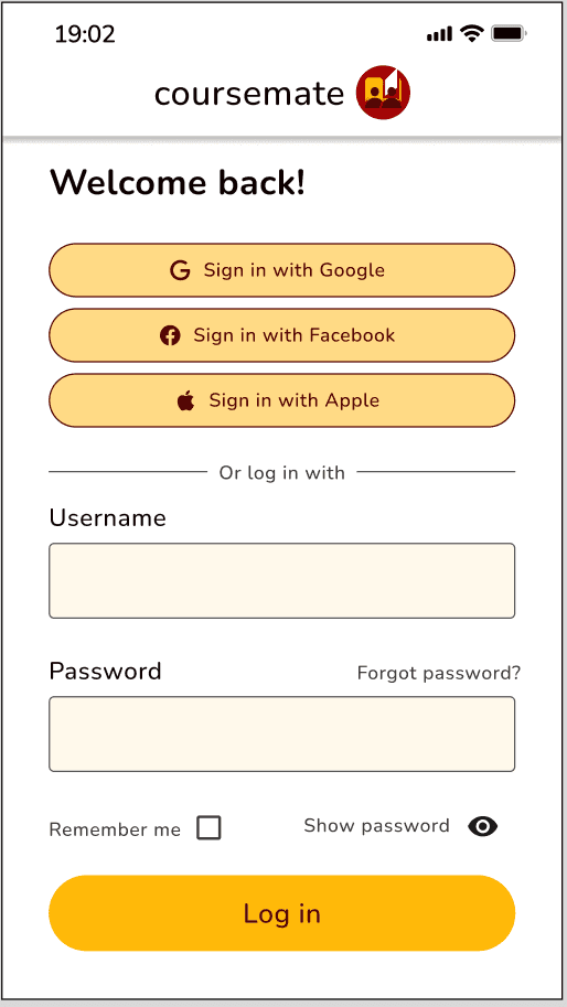
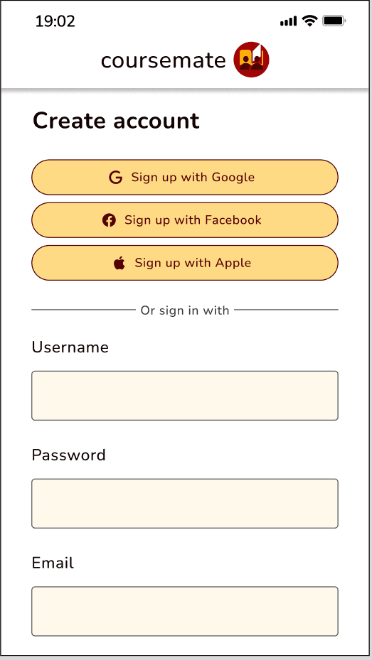
Sign-up and Login
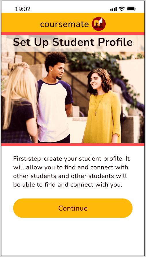
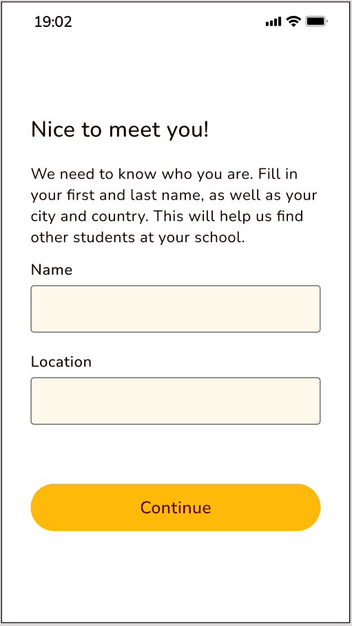
Create a Student Profile
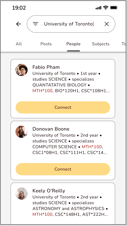
Search students
We started by creating a mood board which helped lead our visual direction and helped us tell our story. The imagery, colours, quotes and typography we chose was inspired by the words: Friendly, Community and Encouraging. Check it out below:
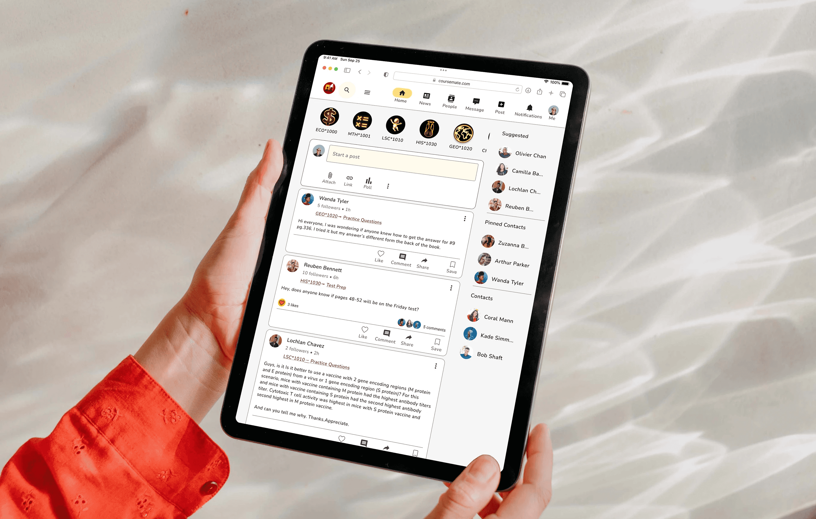
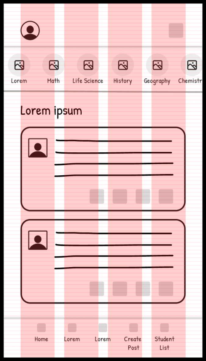
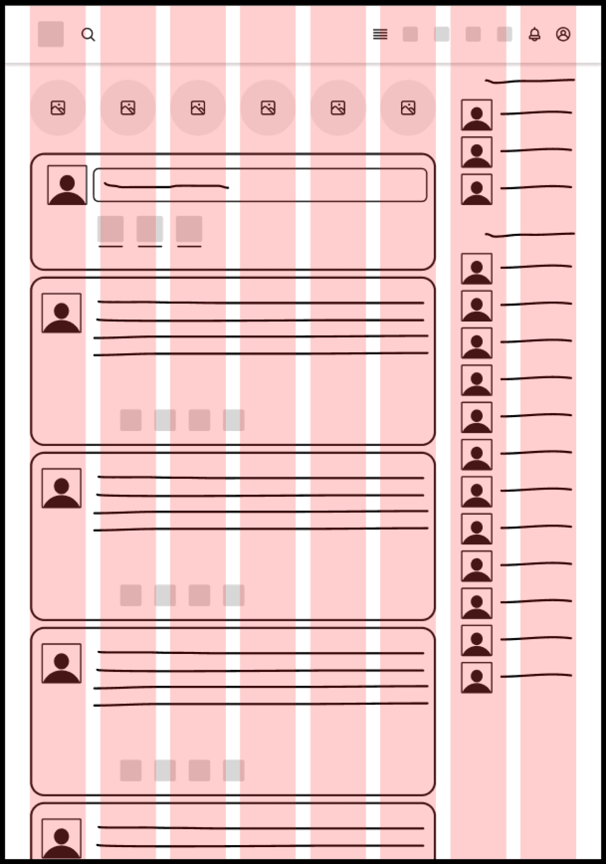
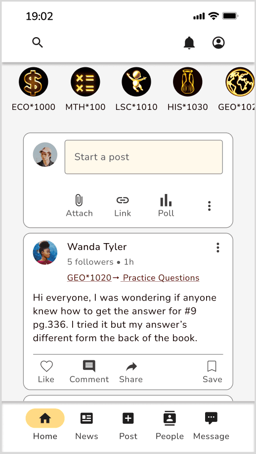
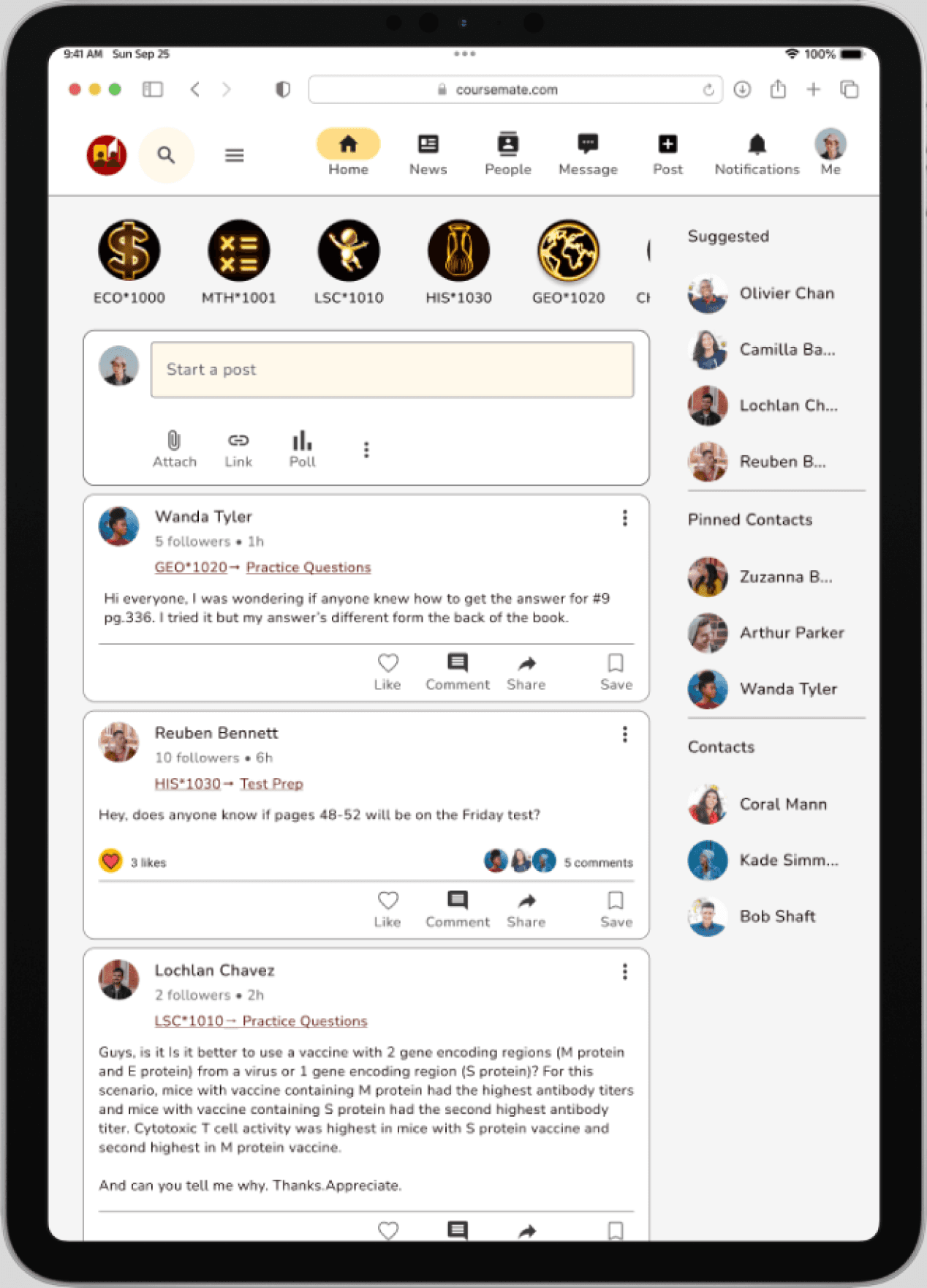
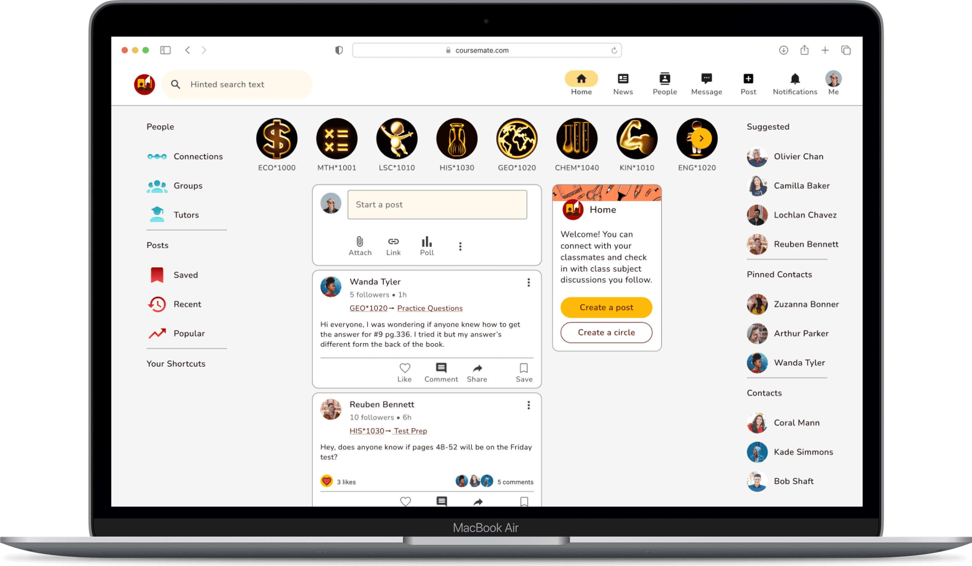
Responsive Design for Final Mockup of Home screen


Key Insight Derived
Mood boards make it easy and intuitive to establish brand identity and the style of your app and are a great first step in the UI design process
An excellent way to rationalize to stakeholders why you’re making certain design decisions
It’s okay to have multiple primary colours and and multiple secondary colours as long as they have a purpose and still maintain constancy in your brand
Breakpoints are essential in making sure designs look good on a variety of different devices and it’s preferable to keep common elements in similar places as not to break continuity
Mockups are a good way to communicate the app’s visual identity and shows the app in a more realistic setting, so stakeholders can see potential issues with style or visual brand before making any decisions
Final Thoughts
Overall, the objective of creating a student centered app that could engage students and allow them to connect to others as well as seek support and encouragement was met.
Along this journey, I was able to utilize and expand my existing UX/UI design set and be introduced to new tools. I got further practice in generating problem statements as well as potential solutions and creating proto-personas, based on the information I was given in the brief to better understand my user’s needs and how to best solve their problem.
I ideated how my user would interact with my app by laying out the fundamental tasks they would want to perform by creating informative user flows in fig jam, whereas before I had used Google drawings and drawing.io. My user flows this time around were very neat, easy to read and featured a legend which was an improvement to past user flows. These guided my design for my wireframes and prototypes.
During the design process, I used a mood board for the first time to lead my visual direction which was a big help and got further practice creating style guides, creating complex components and applying common UI patterns. I was able to also utilize new methods to create consistency through different breakpoints by incorporating burger menus, reducing image size or cropping. In addition, I discovered new ways to create stunning mockups using Angle and Mockuups Studio plugins in Figma. I also learned how to create animations in Figma using Smart Animate.
I am proud of the end result of my labours and enjoy the community oriented visual design and functionality of the app I created. I’m sure this app would be a useful tool for students anywhere.
Next Steps
Conduct usability and preference testing and surveys
Iterate designs and prototypes using test and survey results
Implement animations
Create full prototypes for tablet and desktop breakpoints
Bianca Serkhanian
UX /UI Designer
Lets connect!
You can message me or
email me at bserkhanian.design@gmail(dot)com
@2023 Bianca Serkhanian